Microsoft Word has long been the preferred word processing software for professionals and students alike. Its latest version, MS Word 365, introduces a new default font called Aptos. This blog post examines the origin of the Aptos font and explores its significance in the world of typography.
Why change from Calibri to Aptos
Microsoft has made the decision to replace Calibri, its current default font for Office apps, with a font family known as Aptos. Si Daniels, Microsoft Office Design’s principal program manager for fonts and typography, explains that Aptos was selected because it possesses a more universal appeal and avoids an overly institutional appearance compared to Calibri. The main objective behind creating Aptos was to offer documents a clean and professional aesthetic, ensuring they are visually pleasing and effortless to read. Furthermore, the chosen font needed to exhibit sharpness, uniformity, and excel in display type applications.
It was created by Steve Matteson, who is also responsible for Windows 3.1’s original TrueType fonts (including Times New Roman, Arial, and Courier New) as well as Segoe, which has been Windows’ default system font since Vista and is also used for Microsoft’s current logo.
Aptos Font
Aptos font is a modern sans-serif typeface that was specifically designed for Microsoft by a team of talented typographers. Aptos is characterized by its clean lines, open counters, and balanced proportions. It is inspired by mid-20th-century Swiss typography and belongs to the grotesque style of typefaces. The font comes in monospaced and serifed varieties.
The design process of Aptos font involved careful consideration of various factors. The typographers took into account the evolving needs of MS Word users, as well as the latest trends in typography. They wanted to create a font that would be versatile enough to be used in a wide range of documents, from formal reports to creative presentations.
Key features
One of the key features of Aptos font is its excellent legibility. The designers paid special attention to the spacing between letters and the overall clarity of the font. This ensures that even when the font size is small or the document is printed in black and white, the text remains clear and easy to read.
Another important aspect of Aptos font is its modern and sleek appearance. It has a clean and minimalist design, with straight lines and rounded corners. This gives it a contemporary look that is both professional and stylish.
Inspiration
The designers of the Aptos font drew inspiration from a blend of classic typefaces and modern design trends. Their goal was to craft a versatile and timeless font that also exuded freshness and contemporaneity. While taking cues from popular sans-serif fonts such as Helvetica and Arial, they added their own distinct flair to produce something truly unique.
Aptos font has become increasingly popular among MS Word users due to its clean and professional appearance. This font is suitable for various types of documents, such as business letters and academic papers, as it adds a touch of sophistication and elegance. Additionally, Aptos font can enhance presentations, making them more visually appealing.
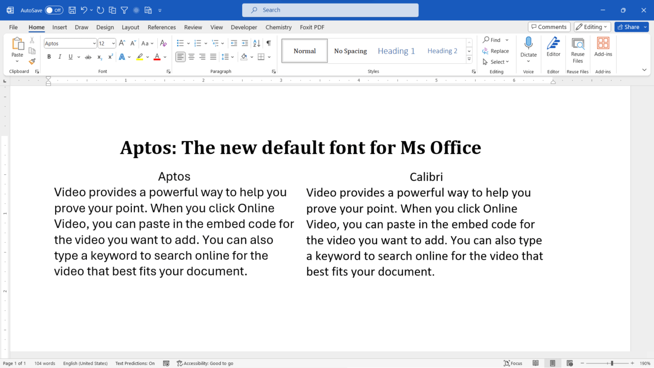
Difference between Calibri and Aptos
Calibri and Aptos are both sans-serif fonts, but there are some differences between them. To compare the two fonts, Office Watch has provided a side-by-side comparison of the Calibri and the new default Aptos. There’s not a lot of difference between Aptos and Calibri fonts to the unpracticed eye. However, Aptos has thicker strokes/lines than Calibri Light and is perhaps more prominent as a heading font.
Conclusion
Aptos font is the latest default font for MS Word 365. It was specifically designed to provide a clean and professional look to documents, while ensuring excellent legibility. With its modern and sleek appearance, Aptos font is a versatile choice for a wide range of documents. Whether you are writing a formal report or creating a creative presentation, Aptos font will help you make a great impression.
Related Posts

C P Gupta is a YouTuber and Blogger. He is expert in Microsoft Word, Excel and PowerPoint. His YouTube channel @pickupbrain is very popular and has crossed 9.9 Million Views.
Great Font. Used it once
Yes, I too use it regularly.
Thanks for sharing your views